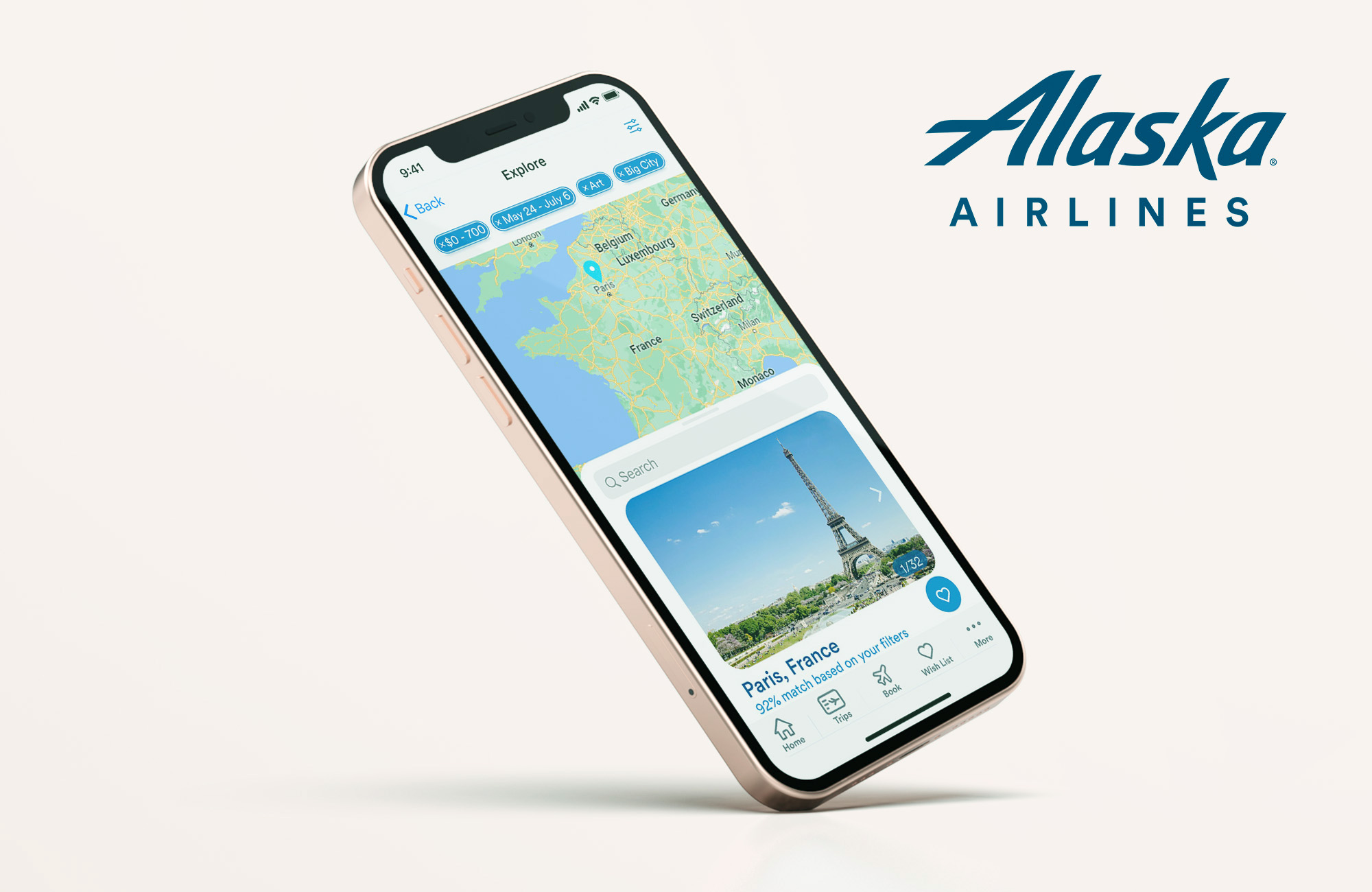
Alaska Airlines App
UX, UI, wireframing, data collecting,
prototyping, user testing
UX, UI, wireframing, data collecting,
prototyping, user testing
Myself and my teammates were given the following brief: Use personalization to inspire exploration for occasional travelers looking for travel inspiration in their booking experience, and use joy as the guiding principle.
We decided to focus on the app because we found from our survey of 65 respondents that the vast majority used the computer to book, but many people still use airline apps for things like viewing their boarding passes or checking in. We hoped the added utility of the app would encourage users to engage more with it and Alaska Airlines in general.
My contributions to the project were: User research, survey questions, an interview, wireframes, personas, the individual destination page, the wish list page, and the price alert mobile views.
View the full case study here


Problems
-
The current app only has a few main functions
- Customers feel anxious due to price fluctuation and are unsure of when to book their flights (discovered via survey responses)
- There is no way to explore travel destinations on the app currently
Goals
-
Offer new ways to explore potential destinations on the app
-
Create a more personal booking experience through Alaska
- Give customers confidence in their decision to book with Alaska by reducing the anxiety surrounding price fluctuation

Key Survey Findings (65 respondents)
76%
of repondents said that they use their computer instead of airline apps to book their flights.90%
of repondents said that they have a destination chosen before beginning the booking process.35%
of repondents said that flying was at least somewhat stressful.Updated Product Statement
For occasional flyers who are planning a trip, the Alaska Airlines app is a service that offers unique ways to explore travel destinations that are catered to users’ needs.
Lofi Prototype


User Test Key Takeaways
- Change “Planner” to “Wish List”
- More clarity with checkbox button on filters overlay - maybe “Apply Filters” button
- Making some of the buttons a little bigger (price alert, add to planner)
- Consolidating different screens onto one screen
Final Outcome
Explore From Home
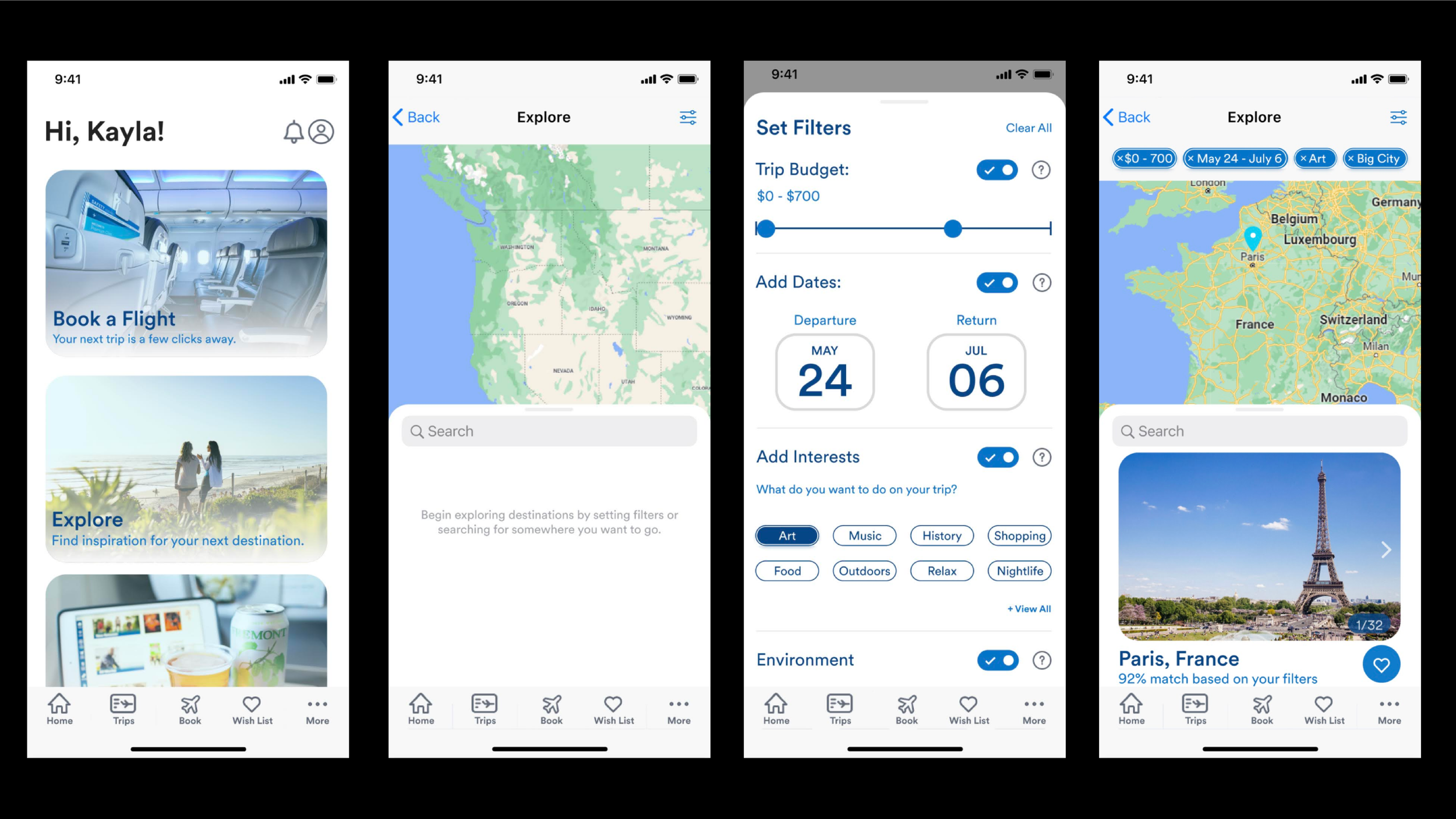
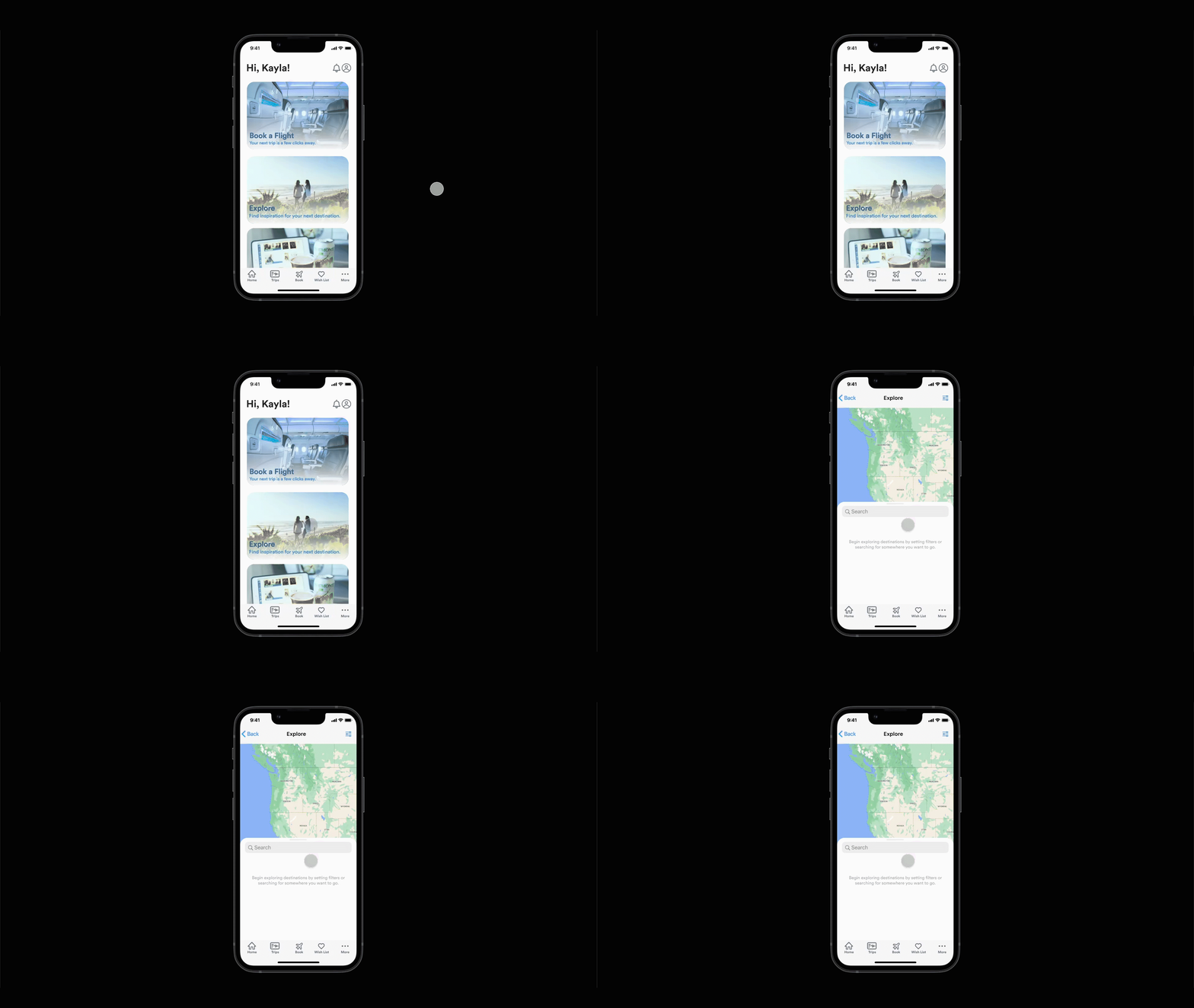
To encourage users to interact with the new Explore feature, we placed it immediately on the home screen. When selected, users are immediately greeted with a map, a search bar, and a filter menu to select their desired search parameters.
Filter Menu
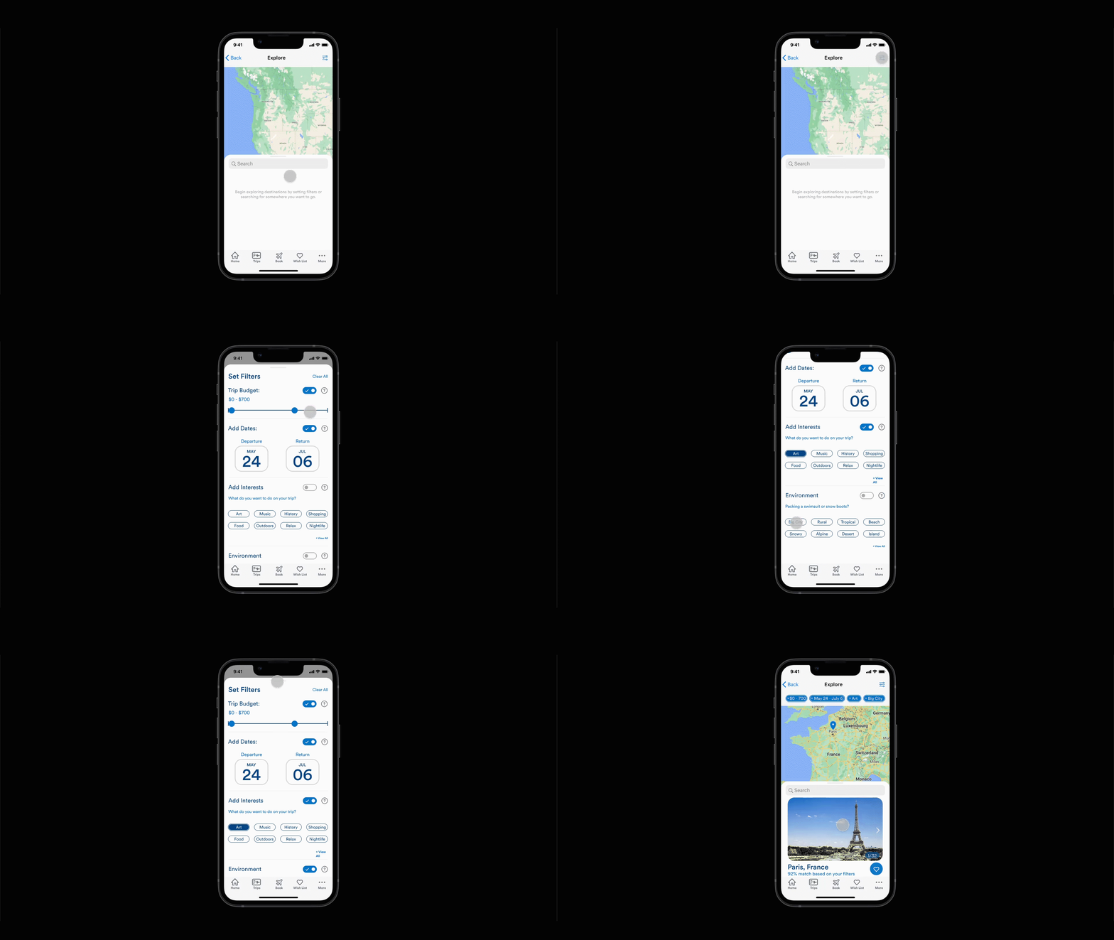
We created a new method of setting and editing filters to reduce friction in the search process. Users can select filters regarding their budget, dates, interests, and environments. These filters show up in the top nav so that users can see what they’re currently filtering by and change it with ease.
Search Recommended
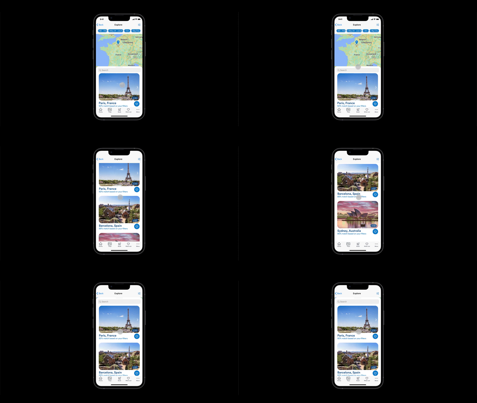
We implemented a “Recommended” feature on the explore page to personalize the app for users. This feature matches users with destinations based on the filters that they have selected, with percentages that inform the user of how fitting each
destination is for them given their chosen filters.
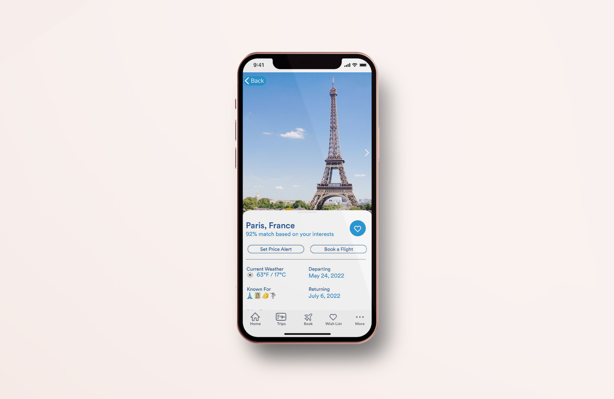
View Individual Destinations
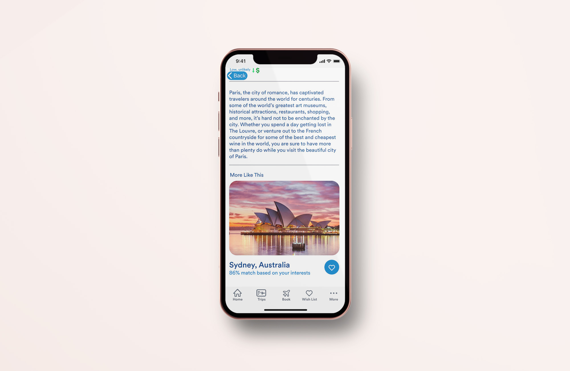
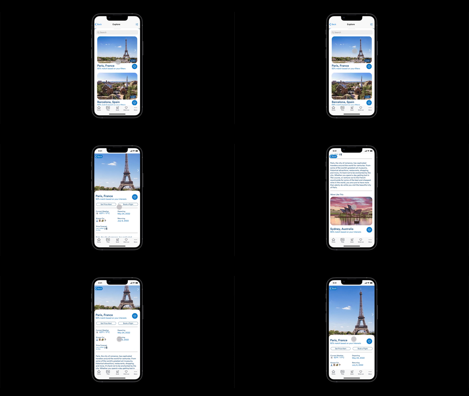
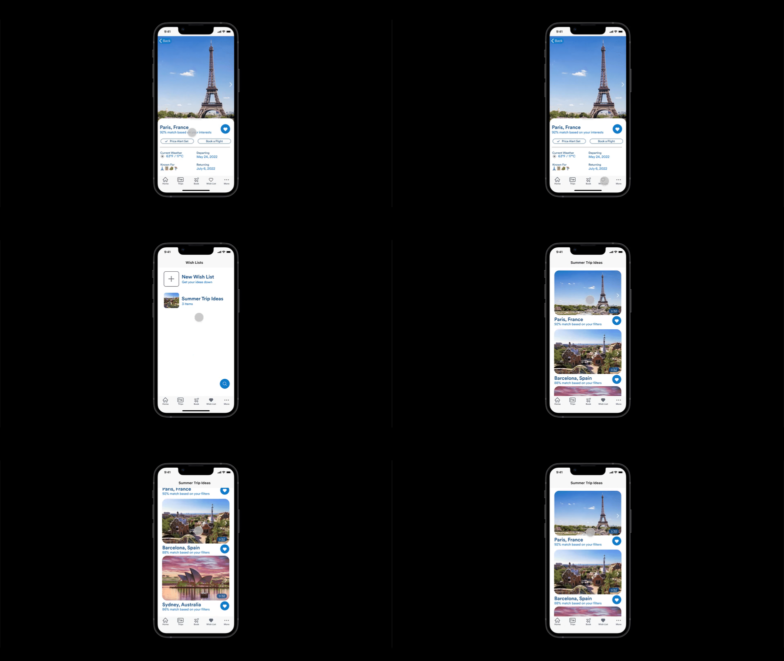
We included information and icons about each destination so that users can click on destination pages and immerse themselves in places through pictures, descriptions, weather, icons, and so much more.
Add to Wish List
We implemented a Wish List feature to promote travel by allowing users to collect all of their travel inspiration in one place that they can easily return to.

Set a Price Alert
Based on the pain point we discovered surrounding price fluctuation in plane tickets, we implemented a price alert feature. Users can now set price alerts from the destination pages. Once a user has activated price alerts, they will be notified daily of the cost of tickets to the destination for their selected dates. This way users won’t have to worry about checking the prices every day or forgetting to check them.

View Wish Lists
We placed the Wish List button on the tab bar, so that users can easily access their saved locations from any screen on the app. They are now easily able to compare all of their options side by side. They can even save places directly from the Wish List main page by selecting the search icon above the tab bar.
Challenges
Some of our initial challenges with the project involved figuring out the best way to organize the new screens and make the process of navigation through the new features as seamless and familiar as possible. It was also a challenge to conceptualize features that would benefit users looking for travel inspiration since this was not something that had been done by an airline previously.
Reflection
All in all, our redesign went quite well. We were ambitious as far as changing what exists in the current Alaska app and created something new and exciting that doesn’t exist in any other airline app out there - all while keeping the components relatable and accessible. As is with all UX, there is never an end to the iterating and redesigning, but we definitely laid the foundation for something worth continuing.
Vision & Future Goals
In the future, we would like to implement the integration of other apps (Spotify, Airbnb, etc.) into the personalization experience to further tailor recommended travel inspiration to users’ needs.
Additionally, we want to add personalization based on previous travel habits so we can anticipate the needs of the user before they start looking for flights to locations they often travel to.