Ace Cider Rebrand
Branding, packaging
Branding, packaging
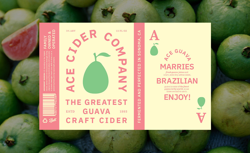
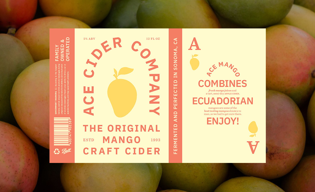
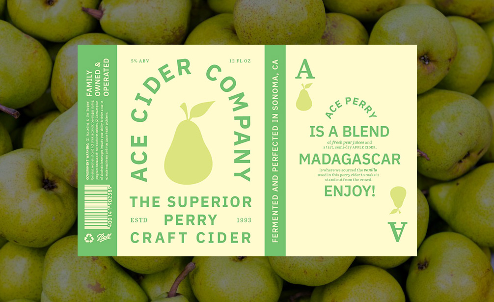
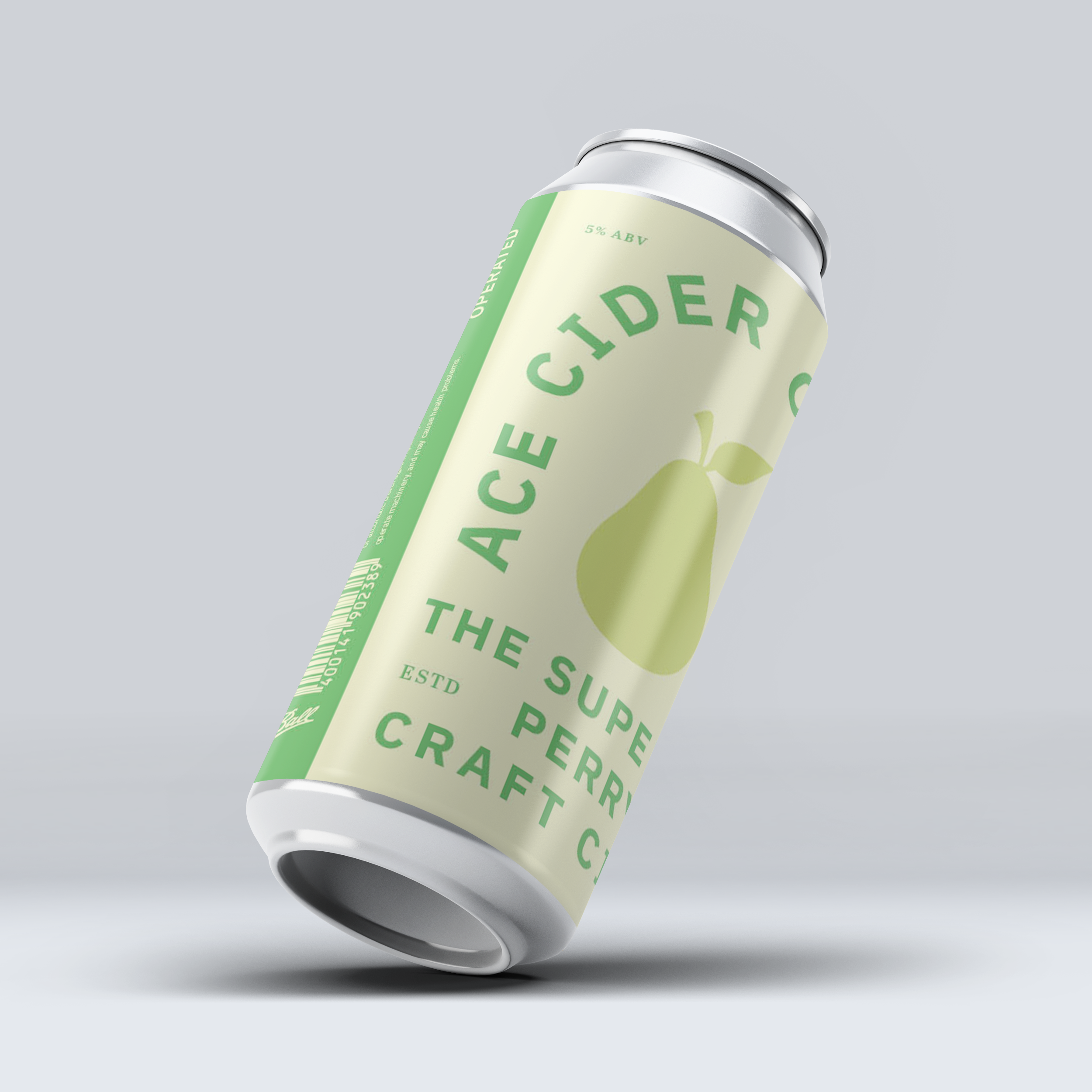
Ace Cider is a family owned and operated cider company that’s been making cider since 1993. Their packaging leaned very heavily into the playing card imagery, which felt appropriate given their story, but was done in a way that felt dated and tacky.
My goal was to broaden their target audience to a younger crowd of cider drinkers through a system of bold text and simple imagery, without ignoring the meaning and connotations of their name.
My goal was to broaden their target audience to a younger crowd of cider drinkers through a system of bold text and simple imagery, without ignoring the meaning and connotations of their name.
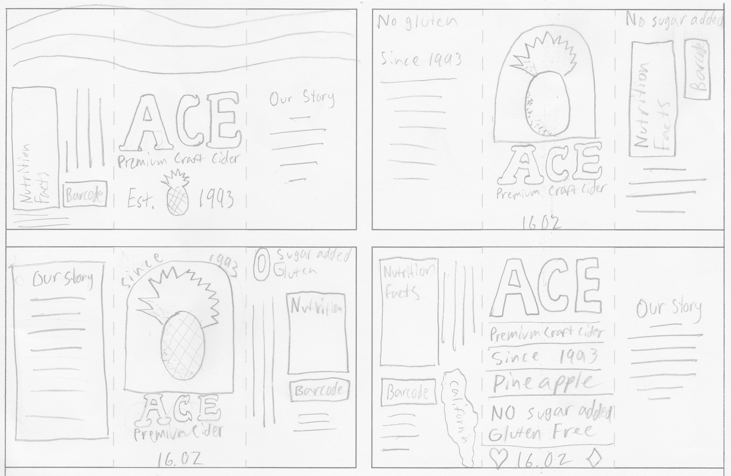
Initial Sketches


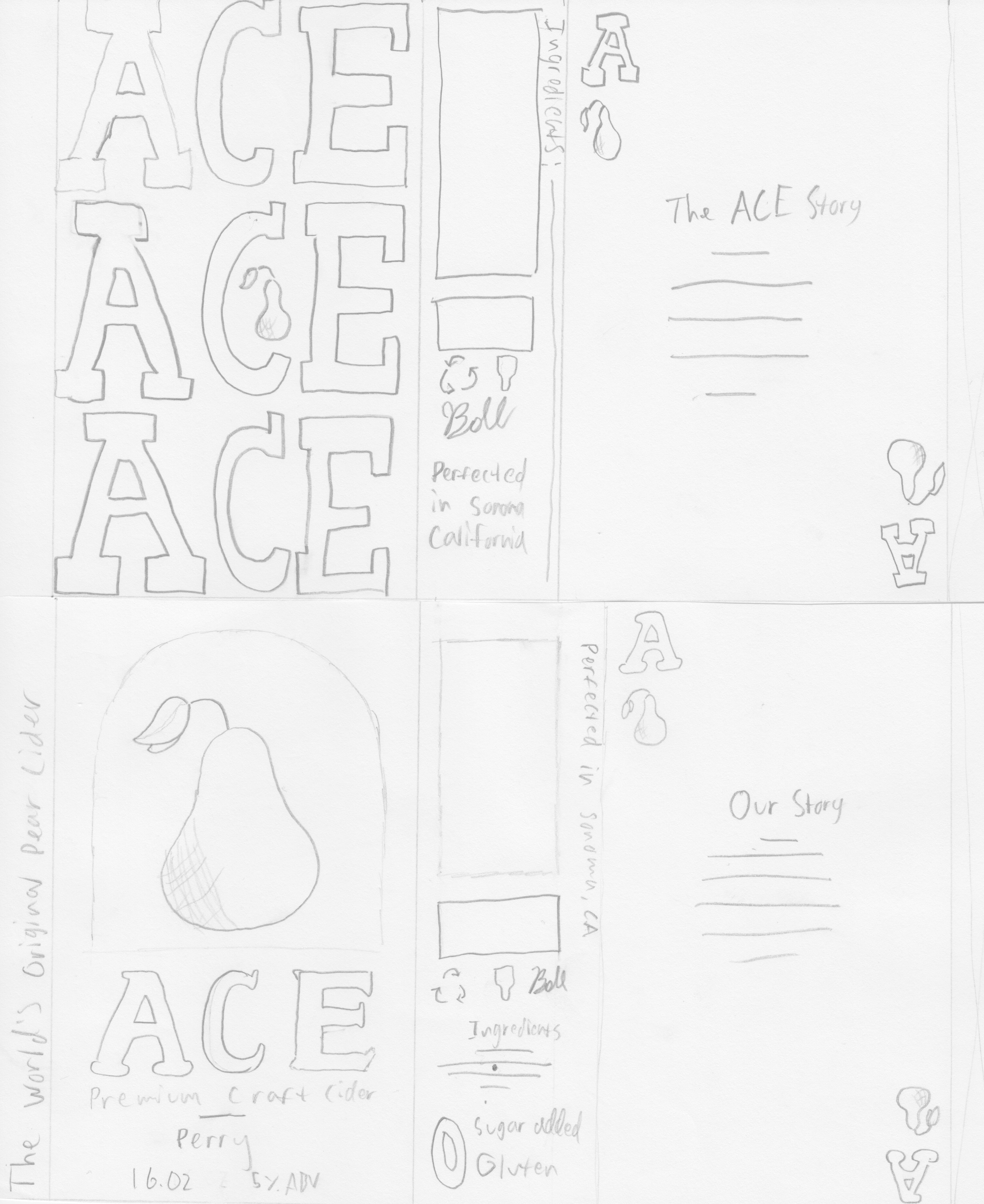
Full Size Sketches


Early Iterations
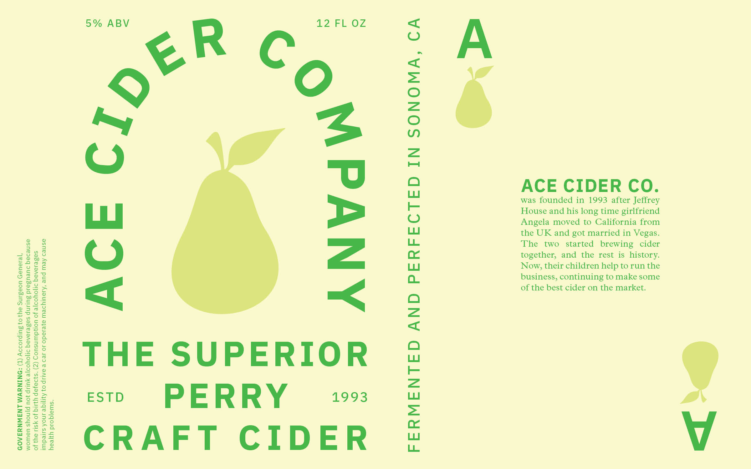
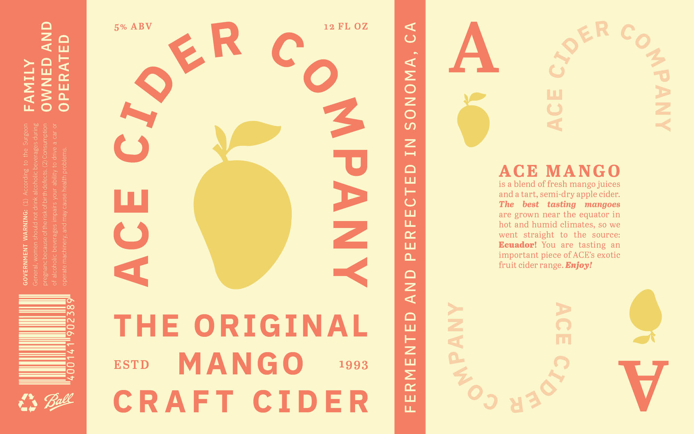
Final Digital Comps